
Learning how to create a landing page that converts isn’t difficult in today’s day and age. If you look at some of the landing page examples across the Internet, you will understand that people have creative brains and let their creativity do the talking. It is even better when you rely on top-quality builders like Strikingly for creating these web pages. After all, we provide you with a platform that helps create a website design without writing a single line of code.
Regardless of what the digital experts believe, creating these web pages is crucial in two important ways. Even though these pages can be classified as homepages, they are part of your website to fulfill certain objectives. In a professional website, every element has a certain meaning and isn’t just displayed without any solid reason. There are many ways to create quality homepages for your Strikingly website. They usually depend on your business niche, the relevant marketing strategies, and overall goals.
Ideal Examples of Landing Pages on Strikingly
1. Swish
Swish is one of the best landing page examples on Strikingly and in many eyes, is the benchmark of many websites on our platform. The biggest elements of this website homepage are the strong headline followed by relevant the call to action (CTA) button. This website starts off by giving an introduction to the brand. It gives an insight into the brand's personality, its scope, and the services that it provides. Apart from the CTA button, you will also see the section where it asks you to provide your contact details.
Through the contact details, you will receive an invitation to look for makeup that suits your personality. It is important that you fill all the fields of the contact section properly, or you won’t receive any invitation from the website owner. The homepage of the Swish website is a fantastic example of how a simple and precise form can be important in generating leads and improving the conversion rate. If users don’t waste time filling out lengthy forms, they are more likely to get involved in your website rather than become frustrated.
2. Fodi
Fodi is one of those landing page examples that believe in cleanliness and straightforwardness. On the homepage, you will find elements to consider i.e. title, subtitle, and the call to action button. The contact details text being found above “Order Now” on a CTA button is pretty cool, and basically commands the customers to get involved in the website. Considering the hero image, we can safely say that they are selling a specified phone stand.


Image taken from Strikingly User’s Website
However, the subtitle makes the idea easy to understand. It is not any random phone stand that you can find in any mobile store, it is called an origami stand, and it can support more than just a mobile phone. By its appearance, it feels like the website is thin and relatively easy to store. Therefore, even if the customers don’t buy from this website, it is still a source of attraction for them as they want to know about the items that the website owner is selling.
3. Camp Campo Rental Gears
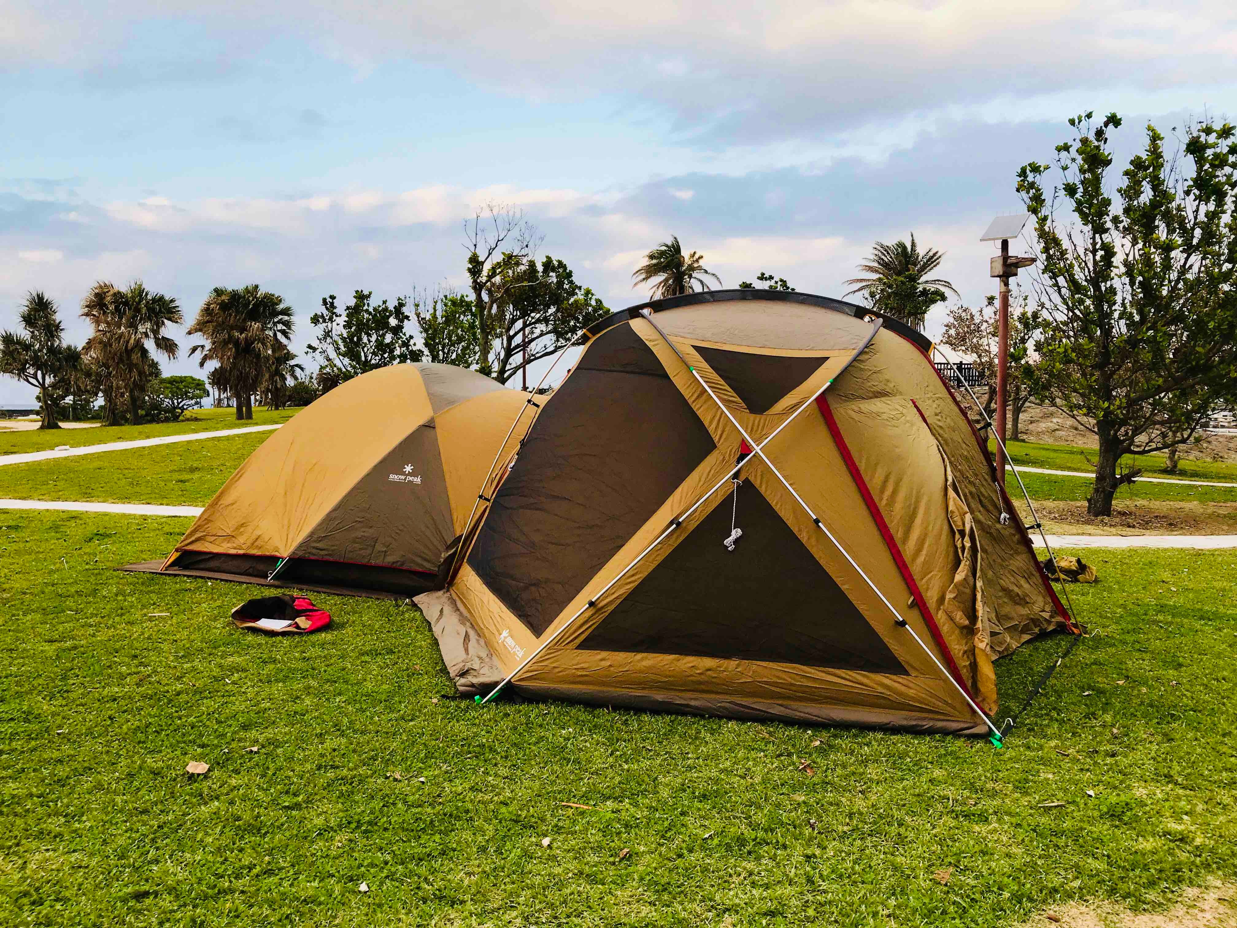
If you want to consider landing page examples that are the benchmark on Strikingly, you don’t need to look past Campo Campo Rental Gears. Out of all websites created on our platform, this website has arguably the most wonderful and unique homepage. This webpage consists of four major elements i.e. website logo, banner image, tagline, and the call to action button. If you want to know about the stuff they are offering, it is the camping gear, as you can suggest by the website name.


Image taken from Strikingly User’s Website
However, people cannot buy it because it is a rental. If you want to know more about the website and the camping gear, don’t hesitate and click on the CTA button that they have provided. It shows you all the wonderful types of camping gear and the way in which you can integrate it while you go camping. If you are interested in the camping requirements, you can go through this website in detail and know about everything that this website stands for.
4. Fighting Pretty
If you have gone through this website, you may know that Strikingly believes in a simple and straightforward website design. Fighting pretty is one of those landing page examples on Strikingly that believes in simplicity and not making things complex for the customers. This website possesses a color that boosts and makes an appeal to the women, which are considered the target audience of this idea. The CTA button is placed on the top-left of your screen with the text “Donate”.


Image taken from Strikingly User’s Website
By clicking on the CTA button, you will get to know about all the technicalities in making a contribution to this website and getting yourself involved in other aspects. The button is not diluted in the overall website content. Therefore, the incoming visitors will be able to identify it once they land on the website. The background is exquisite as it tells a story about empowering women that are battling cancer.
5. Founder Mastermind
Founder Mastermind on Strikingly is one of the best landing page examples that you will come across today. When you land on this website, the things that you will visualize are the website name and a lightbulb. However, it has a subtitle that blows the mind of everyone. If you don’t have any idea about this website and just came across it randomly, you cannot say that you aren’t curious about the things that are displayed on its homepage.
If you are one of the few that aren’t intimidated by the homepage elements, you can click on the CTA button for requesting an invitation, and eventually, you will be looking at a landing page that has a conversion rate. The objective of this website is to create a community of business founders so they can solve their queries, and talk about their ongoing challenges, possible network extension, and business promotion strategies.
6. Pet Milestone Cards
The next in our list of landing page examples comes Pet Milestone Cards. No matter which country or which religion you belong to, you will always find people within your surroundings that have a close connection with pets. As you can see by the website name, the homepage discusses pets, particularly dogs. If you have a passion for pets, this homepage will be pleasant to your eyes.


Image taken from Strikingly User’s Website
The best thing about this website is the CTA button. The text above the button i.e. “free” makes the CTA button big and bright. When you see something purchasable without any cost and see the CTA button saying “Buy Now”, it is likely that you will at least consider your buying decision. To go with this, the home page displays different types of pets. If that wasn’t enough in terms of marketing, this website page also displays all the business cards related to different pets.
7. Sow Body Fitness
As you can see by the name, Sow Body Fitness is one of those landing page examples that promote fitness and inspires people to have the best possible physical condition. Nowadays, it is not just about the salary that you earn every month. You must also be active and mobile to handle different situations. For that, you must have maximum fitness or play different sports. This website is operated by two life coaches and personal trainers.


Image taken from Strikingly User’s Website
Considering the lack of gyms there were during the COVID-19 pandemic, many website owners like this have been able to turn a dreadful situation into something productive. The CTA button enables you to book different sessions. The sessions can even be used for just consultations.
8. Spin Skate
Spin Skate is one of those landing page examples that are focused on selling longboard magazines featuring women. This website proves that skateboarding is equally for women as it is for men. The hashtag used on it i.e. Skate Like A Girl is the icing on the cake of this wonderful website.
Conclusion
It was only a few years ago that creating a website was considered one of the toughest jobs in the world. Some people used to think that you have to do many hirings and appoint a technical staff and look into the daily updates related to a particular website. However, things have completely changed recently as multiple quality website builders are in the market to make life easy for web developers around the world. You can only look at a decent example of landing page on Strikingly for further assistance.
If you consider the landing page examples, they are usually associated with the biggest website builders in the world, such as Strikingly. We help you create a professional website without breaking a sweat. Just a few clicks and your desired website will be right in front of your computer screen. If you have any problems related to website development, you can contact our Happiness Officers today, who are available 24/7 to listen to your queries. So, create the best homepages on Strikingly and improve your conversion rate.


