
While your website and social media accounts must be optimized to be relevant, searchable, customer-centric, and famous, you need to better serve your customers and attract more potential customers. One of those things is a landing page that converts. This article will talk about the best landing page examples that you can find inspiration in to create the best landing page for your website.
Landing Page
Landing page examples are important because a landing page that converts means different things to different people and businesses. But first, let’s define what landing page is, shall we? A landing page refers to a page that serves one definite and clear purpose only: Entice site visitors to click and push through that one call to action that you set. Now, that call to action button or form can collect email addresses, encourage subscriptions,o increase sign-ups and registrations, or sell a product or service. No matter the case, the point is that the best landing page examples fulfill the purpose of being a marketing tool that drives conversions.
Best Landing Page Examples
1. Fodi


Image taken from Strikingly User’s Website
To start off our list of landing page examples, check this landing page that incorporates a clean and straightforward design. It features a picture, a title, a subtitle, and of course, a call to action button. This is an example of landing page that uses an “Order Now!” or a purchase button as its intended action. From the looks of its hero image, we can conclude that it seems like what they’re selling is a phone stand. But with the help of its subtitle, the interest of its site visitors is piqued because it’s not just any regular stand. It is indeed an origami stand - and it could stand more than a phone. By its looks (or by exploring their website), the stand looks thin and relatively easy to store. Yet, it seems durable and robust enough for a stand. So, even if customers are not convinced to order right there and then, this landing page still holds much purpose because it makes potential customers curious and interested in what they are actually selling.
2. Camp Campo Rental Gears


Image taken from Strikingly User’s Website
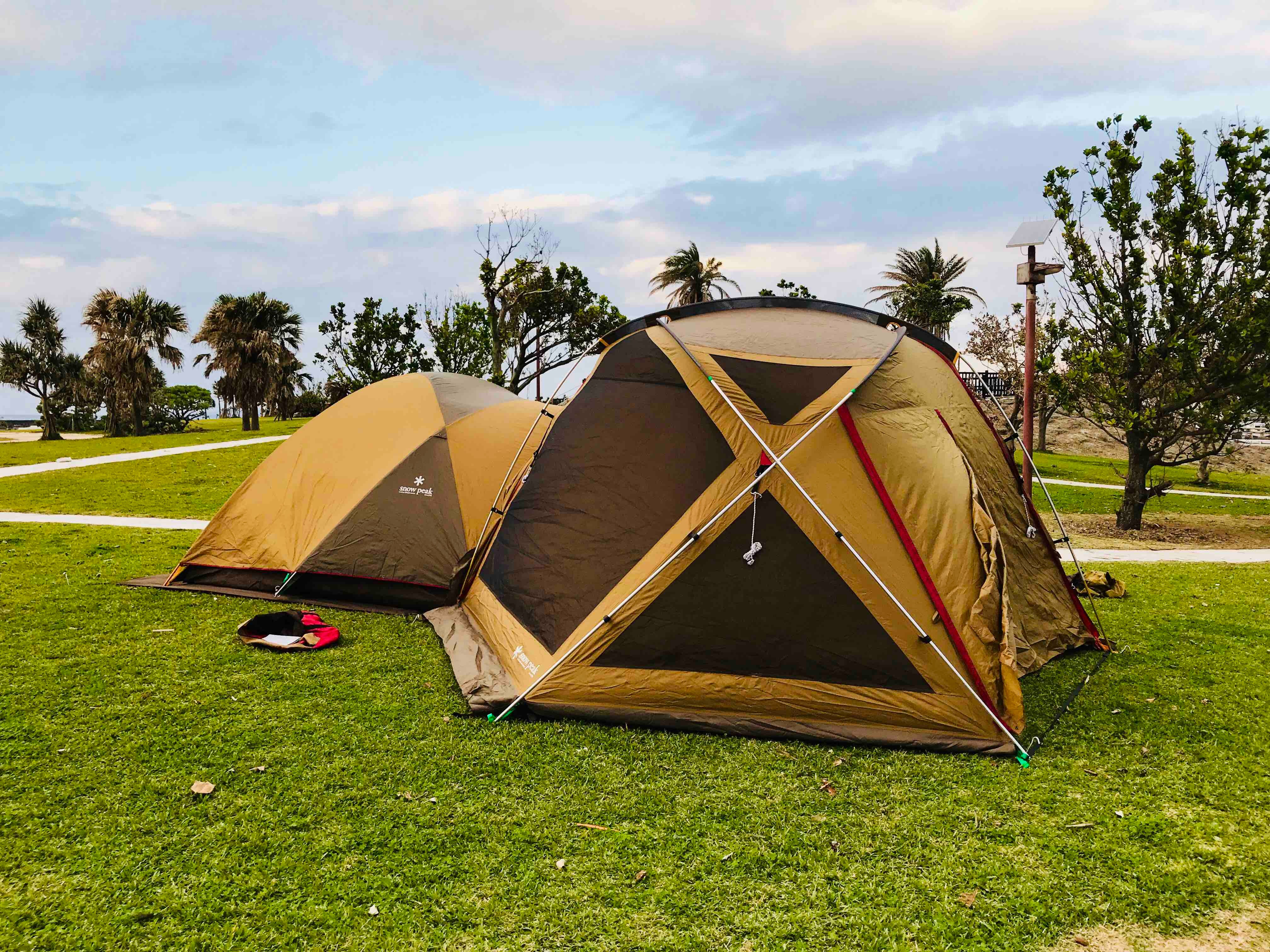
The following example of landing page is simple and straightforward. It features four things: Its logo, its banner image, its tagline, and its call to action button. What are they offering? Camping gear. Can people buy it? No, it’s a rental. Want to know more and rent some for yourself? Feel free to click their call to action button and be directed to a map of all the camping sites in Japan. This landing page entices visitors with beautiful camping gear and shows them the fun they can have when they go camping. Indeed, this is one of the best landing page examples that exemplify how easy and straightforward it is to pull customers in. And if you’re interested in their varieties of camping equipment, you can explore their website more and know all about everything they offer.
3. Founder Mastermind


Image taken from Strikingly User’s Website
Now, this is one of the landing page examples that can be irresistible to curious minds. It only has a lightbulb and its name, but it has a subtitle that subtly lets everyone know how exclusive this is. If you don’t exactly know what this website is about or what it is for and you just happen to stumble upon it, can you tell me that you won’t get the least bit curious about it all? If you’re one of those spontaneous people, you might very well click that call to action button to request an invitation - and voila, this immediately becomes a landing page that converts. On the other hand, if you know precisely what this website is for, an invite-only community of business founders to solve problems, discuss challenges, extend your network, and promote each other’s businesses, you would definitely want to click that call to action button. An invitation from an exclusive such as this helps you and helps your business grow.
4. Hip’s


Image taken from Strikingly User’s Website
Hip’s is a website that also builds a community together - this time, a community that is all about sports. When you go to their website, you will be met with a landing page that gives you the holistic idea of what putting your email and clicking that call to action button to send it and register will allow you to do. This is also one of those landing page examples that feature a video for their banner image. In this series of videos, you will be shown how their community comes together to jog, play in courts, train together, rock climb, and just enjoy having people share their love for sports. If you explore their site even more, you will know that this was community through the emails their customers submitted and a phone application that creates a detailed profile to connect them to all the sports activities they want to do with a friend.
5. Oriano Castro


Image taken from Strikingly User’s Website
Oriano Castro starts her website with a landing page that features her face and her short introduction. It’s not anything formal, though. She takes it candidly - as if the people who will see it are a newfound friend or acquaintance. This is an excellent strategy to incorporate for a landing page that converts because it does not alienate potential customers easily. This kind of introduction emphasizes her humanity. When accompanied by the typography and joyful touch of yellow of her site, it also sends a message of her fun and creative tendency. Her call to action button is unique as it's not the typical “purchase” or “register” type. Instead, she urges you to see her work. And with her lively introduction, wouldn’t you want to get to know her more and indeed see her work? This is one of the best landing page examples for online portfolios. Because spoiler alert! Oriano Castro is a product manager that has achieved much.
6. Pet Milestone Cards


Image taken from Strikingly User’s Website
This next one on our list of landing page examples is one that practically screams - barks to the whole world what they’re all about: Puppies, Cards, Dogs, Cards - Dogs, dogs, dogs! As clear as the blue sky up above, this business website is not shy about what they have to offer. And if you are a pet lover, particularly dogs, then this landing page would be like candy to your eyes as it features different kinds of dogs. And if that’s not smart enough of a marketing move, they also have them with all of their eyes set on all the types of cards that this business offers - as if these dogs are practically asking for them themselves. In addition, they also have this big and bright call to action button, which has the words “free” directly on top of it. This is one of those landing page examples that really went all-out in being customer-centric.
7. Sow Body Fitness


Image taken from Strikingly User’s Website
This next landing page is another one that features a recent people’s favorite: exercise and workout. With the pandemic sending everyone home, people have started finding ways to continue their workout and fitness routines even with all the gyms closed. Thus, businesses like Sow Body Fitness, owned and operated by two life coaches and personal trainers, have found a way to thrive and turn the dreadful situation brought by the COVID-19 virus into something positive and profitable. This is one of the landing page examples that also go on a different path for their call to action button. Because instead of leaving your email like you usually do for all these workout sites, it encourages you to directly book a session (which could be just a consultation or preliminary work-up).
8. Spin Skate


Image taken from Strikingly User’s Website
Spin Skate is a website dedicated to selling a longboard magazine that features: women. Now while this shouldn’t be a surprise anymore, we are, after all, in the 21st century already. This magazine emphasizes that skateboarding is not just for men. The hashtag that can be subtly seen on their banner image: #SkateLikeAGirl, shines light that this magazine empowers women in this area of expertise. They also go out of the traditional “Subscribe to this newsletter” caption of their call to action button, but rather, they put on “I want this mag!”, as if to signify that by signing up, you are not just subscribing, you are doing so with much enthusiasm and passion for the movement that this magazine stands for. This is one of the landing page examples that does not encourage customers but also gives them something to advocate and fight for.
9. Swish Makeup


Image taken from Strikingly User’s Website
Swish Makeup is one of the landing page examples that are direct to the point yet still fab. Much like those popular dating apps, this landing page features a title that tells you to swipe right too, but this time on the styles that you love and the styles that suit you. Suppose you want to know more about their business. In that case, their advocacy and main purpose is to make everyone feel beautiful and find the makeup to help them feel beautiful no matter their color or nationality. They also go a bit unique with their call to action button as they do not simply ask you to “purchase” or “order” or “browse our catalog”, they made it so that their potential customers are directly asking for their help to find the right makeup. This makeup suits their complexion and their style.
10. Watchmaster


Image taken from Strikingly User’s Website
Watchmaster is another one of the best landing page examples that are so beautifully and artistically designed. Once you get to their website, you are faced with a banner video. That’s right, a video is what welcomes you. A video featuring their products and all they have to offer is presented in what seems like a trailer out of the best movies. In addition to that, they also describe in detail an application they created for this business. More than their fabulous video trailer, what makes this landing page unique is that it has two call-to-action buttons, neither of which is an action that is commonly asked by business websites. It gives potential customers the option to watch the full video trailer of what their business is all about or to easily get their personalization app from Google Play.
The best landing page is one that best exemplifies the purpose of your business. No one example of landing page will be perfectly appropriate for your business. Still, you can more easily design and build the best landing page for your business with the proper inspiration and reference. And we all know that it’s not a walk in the park to handle a business, especially in today’s time and age. But knowing all the tools that you can use and how to take advantage of each of them, you effectively open yourself up to more opportunities to grow your business into the success that you already know it to be. Let Strikingly help you in accomplishing that, so sign up now!


