Mastering Ecommerce Website Navigation for Better Sales
Mastering Ecommerce Website Navigation for Better Sales

Creating a smooth and intuitive ecommerce website navigation experience is essential for turning visitors into happy customers. When your site makes it easy for shoppers to find what they want without frustration, sales naturally go up. In today's competitive online world, mastering the art of creating clearer product category paths and improving collection discovery on mobile devices can make all the difference.
Many top brands understand that effective ecommerce website navigation isn’t just about aesthetics; it’s about guiding customers effortlessly through their shopping journey. They invest time in simplifying product filtering options and reducing unnecessary browsing steps to keep visitors engaged. When your navigation system is clear and user-friendly, it encourages more browsing, longer visits, and ultimately more conversions.
In this guide, you’ll learn practical strategies to create clearer product category paths that help shoppers find products quickly. You’ll discover how improving collection discovery on mobile devices can boost engagement on smartphones. Plus, we’ll share tips on simplifying product filtering options and reducing unnecessary browsing steps so your customers enjoy a seamless shopping experience from start to finish.
Understanding the Power of Effective Navigation

Zine Website Template from Strikingly
Ecommerce website navigation is the backbone of a smooth shopping experience. When customers can easily find what they’re looking for, they’re more likely to stay longer and make a purchase. Creating clearer product category paths helps shoppers navigate effortlessly, reducing frustration and boosting conversions.
Good navigation isn’t just about looks; it directly impacts how well your site performs in turning visitors into buyers. Simplifying product filtering options allows customers to quickly narrow down choices without feeling overwhelmed. Improving collection discovery on mobile devices is also crucial because most shoppers browse on their phones, and a confusing layout can turn them away in seconds.
Many challenges come with ecommerce website navigation, like cluttered menus or too many steps to reach a product. Reducing unnecessary browsing steps speeds up the process and keeps potential buyers engaged. When you focus on creating clearer product category paths and streamlining the overall flow, your store becomes more user-friendly and sales-friendly.
Creating Clearer Product Category Paths
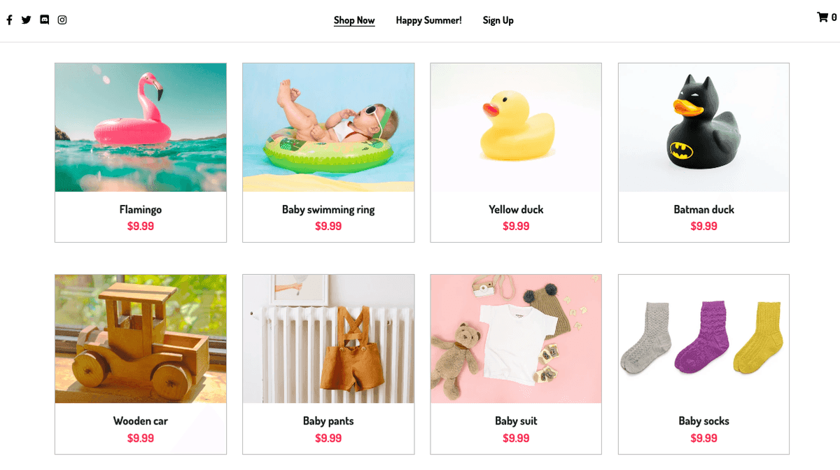
Peggi Store Template from Strikingly
Creating clearer product category paths is essential for guiding your customers effortlessly through your online store. When your ecommerce website navigation is intuitive, shoppers spend less time wandering and more time buying. Well-organized categories help reduce unnecessary browsing steps, making the shopping experience smoother and more enjoyable.
Clear product category paths also improve collection discovery on mobile devices. Since many users browse on their smartphones, simplifying navigation ensures they can find what they want quickly without frustration. Properly structured categories prevent confusion and keep visitors engaged, boosting the chances of conversions.
To create effective product category paths, start by grouping similar items logically. Use straightforward labels that reflect what customers are searching for and avoid overly complicated menus. This approach helps create a seamless shopping journey, especially when combined with strategies used by top brands to optimize ecommerce website navigation.
Organizing Products for Intuitive Browsing
Organizing products in a way that makes sense to your customers is the foundation of creating clearer product category paths. Think about how people naturally search for items and group related products together under simple headings like Men’s Shoes or Kitchen Gadgets. This clarity not only enhances user experience but also reduces unnecessary browsing steps that often frustrate shoppers.
When you focus on improving collection discovery on mobile, clear categories become even more critical because screen space is limited. Use icons or images alongside labels to make navigation more visual and engaging. Remember, the goal is to make every step straightforward so visitors can find their favorite products without getting lost in complex menus.
Strategies Used by Amazon and Etsy
Amazon and Etsy excel at creating clear paths within their ecommerce websites by employing smart categorization techniques that simplify collection discovery on mobile devices. Amazon uses mega menus with broad categories broken down into subcategories, allowing users to drill down quickly without feeling overwhelmed. Etsy emphasizes niche-specific collections with filters that streamline browsing, making it easier for shoppers to discover unique items efficiently.
Both brands understand that reducing unnecessary browsing steps increases conversion rates significantly. They design their navigation systems so users can jump straight into relevant sections instead of clicking through endless pages or confusing filters—an essential lesson in creating clearer product category paths for any online store.
Tips for Structuring Your Shop for Clarity
Start by analyzing your current layout and ask yourself if customers can easily find what they need within a few clicks—if not, it’s time to reorganize those categories! Keep labels simple, descriptive, and consistent across all sections to enhance ecommerce website navigation clarity. Incorporate visual cues like icons or images where possible to guide users intuitively through collections.
Another tip is to minimize filtering options initially; too many filters can confuse shoppers rather than help them—this directly impacts reducing unnecessary browsing steps on mobile devices where space is tight. Regularly test your structure from a user perspective; gather feedback from real shoppers about how easy it is to navigate your shop and adjust accordingly until you achieve a seamless shopping flow that encourages conversions.
Improving Collection Discovery on Mobile Devices

Strikingly Mobile App
Making sure your customers can easily find collections on their smartphones is crucial for boosting sales and creating a smooth shopping experience. Mobile optimization trends show that shoppers want quick, simple ways to browse products without frustration. When you improve collection discovery on mobile, it helps reduce unnecessary browsing steps and keeps visitors engaged longer, increasing the chances of conversions.
A lot of ecommerce website navigation struggles come from poorly designed mobile menus that are hard to navigate or cluttered with too many options. By focusing on creating clearer product category paths tailored for mobile screens, you make it easier for users to locate what they want fast. Simplifying product filtering options further enhances this process because customers can refine searches without feeling overwhelmed or lost in a maze of choices.
Tools like collapsible menus, swipe gestures, and sticky headers are game changers when improving collection discovery on mobile devices. These tools help streamline the navigation experience by reducing unnecessary browsing steps and making collections stand out more clearly on small screens. When you implement these features thoughtfully, your site becomes more user-friendly and encourages shoppers to explore more collections effortlessly.
Simplifying Product Filtering Options

When it comes to creating a seamless shopping experience, simplifying product filtering options is essential. Too many filters can overwhelm shoppers and make the process confusing, which often leads to frustration and cart abandonment. By streamlining your filters, you help customers find what they need faster, boosting overall ecommerce website navigation and increasing the chances of a sale.
Overloading your site with numerous filtering choices can actually hinder user experience. Customers might feel lost or overwhelmed trying to decide which filters to apply, leading them to leave without purchasing. Instead, focus on offering the most relevant filters that guide shoppers effortlessly through creating clearer product category paths and improving collection discovery on mobile devices.
Looking at successful stores like Shopify shops shows us that fewer, well-organized filters make a big difference. These stores use simple categories such as size, color, or price range that are easy to understand and quick to select. Implementing similar strategies helps reduce unnecessary browsing steps and makes your site more user-friendly for all visitors.
To implement user-friendly filters effectively, start by analyzing what your customers search for most often. Use clear labels and group related options together so shoppers can quickly narrow down their choices without feeling overwhelmed. Regularly review filter performance and adjust based on customer feedback to keep the shopping journey smooth and enjoyable.
Reducing Unnecessary Browsing Steps
When it comes to creating clearer product category paths and improving collection discovery on mobile, reducing unnecessary browsing steps is a game changer. Customers often abandon their shopping carts because they get lost or frustrated navigating through cluttered menus. Simplifying this process keeps shoppers moving smoothly from landing on your site to completing their purchase.
One of the best ways to streamline ecommerce website navigation is by offering shortcut techniques that help users find what they need faster. Think about adding quick links, prominent search bars, or even one-click filters that guide customers directly to popular categories or products. These small tweaks make a big difference in reducing unnecessary browsing steps and keep your visitors engaged longer.
Take inspiration from sites like Zappos, which excel at creating clearer product category paths and improving collection discovery on mobile devices. Their streamlined menus and intuitive filters allow users to browse effortlessly without feeling overwhelmed. By mimicking these best practices, you can help your customers navigate with ease and avoid the common pitfalls of complicated ecommerce website navigation systems.
Another crucial aspect is streamlining the checkout and navigation flow itself. Removing redundant pages or steps during checkout not only speeds up the process but also minimizes cart abandonment caused by confusing pathways. When you simplify product filtering options and reduce unnecessary browsing steps throughout the entire shopping journey, you're making it easier for customers to complete their purchases confidently.
In essence, reducing unnecessary browsing steps involves rethinking how your site guides visitors from interest to action. Focus on creating clearer product category paths, improving collection discovery on mobile devices, and simplifying product filtering options—all essential elements that enhance overall ecommerce website navigation experience. The result? Happier customers who enjoy a seamless shopping adventure from start to finish.
Leveraging Strikingly Website Builder for Better Navigation

Strikingly Landing Page
Strikingly is a fantastic tool for anyone looking to improve their ecommerce website navigation without the headache. Its user-friendly interface makes creating clearer product category paths simple and quick, even if you're not a tech wizard. When your site has well-structured menus and sections, visitors can find what they want faster, reducing unnecessary browsing steps that often frustrate shoppers.
Why Strikingly Makes Creating Clear Paths Easy
One of the biggest perks of using Strikingly is how effortlessly you can organize your ecommerce website navigation. The platform offers drag-and-drop features that let you customize menus and sections with ease, helping you create clearer product category paths that guide customers seamlessly through your offerings. This means less confusion and more conversions because shoppers spend less time wandering aimlessly and more time making purchases.
Customizing Menus and Sections Seamlessly
With Strikingly, customizing menus to suit your store's needs is straightforward. You can add or remove sections quickly, ensuring your collection discovery on mobile is optimized for smaller screens. By simplifying product filtering options within these menus, you make it easier for customers to narrow down choices without feeling overwhelmed, which keeps them engaged longer and boosts sales.
Tips to Maximize Strikingly for Ecommerce Success
To get the most out of Strikingly for improving ecommerce website navigation, focus on creating clear paths that highlight key categories upfront. Use visual cues like icons or images to make collection discovery on mobile more intuitive—this helps customers find products faster on smartphones. Also, streamline your filtering options so shoppers can refine their searches easily without clicking through unnecessary steps; this reduces unnecessary browsing steps that might cause drop-offs.
By leveraging these strategies with Strikingly’s intuitive tools, you’ll create a smoother shopping experience that encourages repeat visits and higher sales—all while making sure your site’s navigation stays clean and effective at every step of the customer journey.
Conclusion

Mastering ecommerce website navigation is the secret sauce to boosting your online sales and creating a seamless shopping experience. When you focus on creating clearer product category paths, customers can find what they need faster, leading to higher conversions. Remember, simplifying product filtering options and reducing unnecessary browsing steps can make your site feel more user-friendly and inviting.
Effortless shopping isn’t just about good products; it’s about making every step smooth for your visitors. Improving collection discovery on mobile devices ensures shoppers stay engaged no matter what device they use. By streamlining navigation, you turn casual browsers into loyal buyers who enjoy their journey through your store.
Strikingly offers tools that help you create better ecommerce website navigation easily. With customizable menus and sections, you can showcase collections clearly and guide users effortlessly from landing pages to checkout. Using Strikingly simplifies the process of creating clear paths for customers, helping you boost sales without the headache.
